
Working on multimodal projects is a wonderful reminder that product design encompasses not only digital experiences and physical objects, but also the systems and environments that contain them.
Research
Design
QA
A11y Consulting
1 project manager
1 product designer 👋🏻
1 engineer
2021
The Transgender Law Center (TLC) is the largest trans-led organization in the United States. Their mission is to keep transgender and gender nonconforming people alive, thriving, and fighting for liberation. One of the many ways which this organization advocates for transgender individuals is by providing resources to the public on how to better push back against discriminatory practices they see happening in the world.
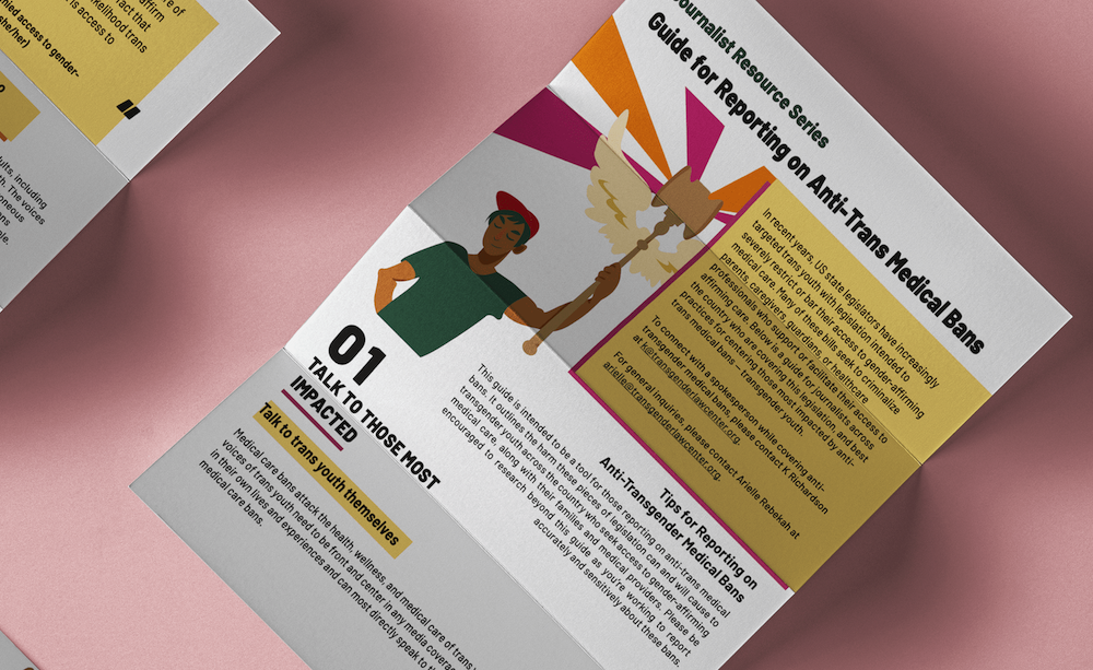
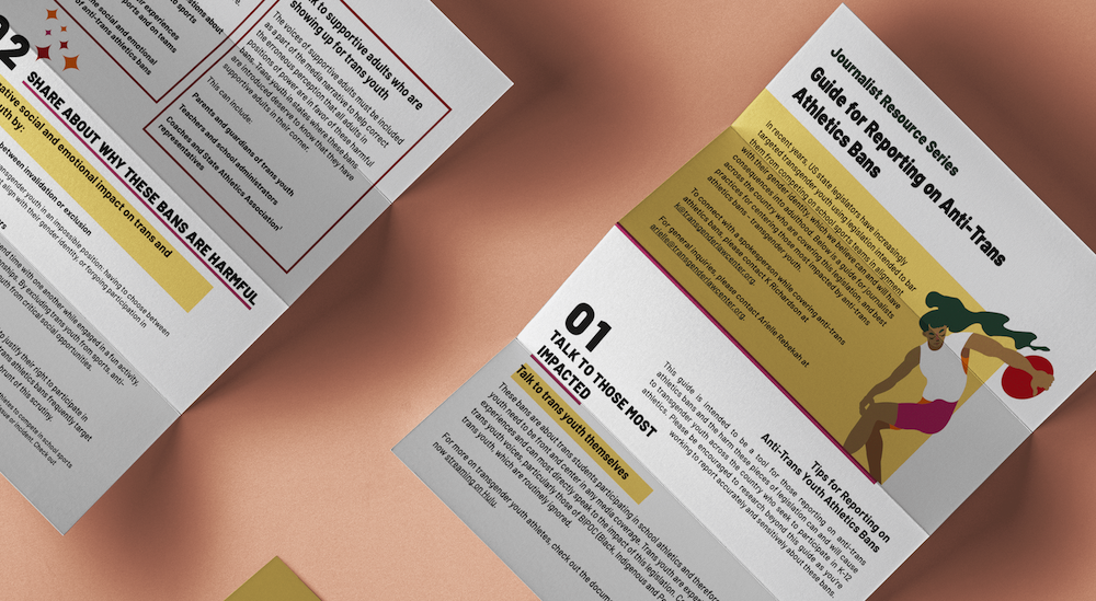
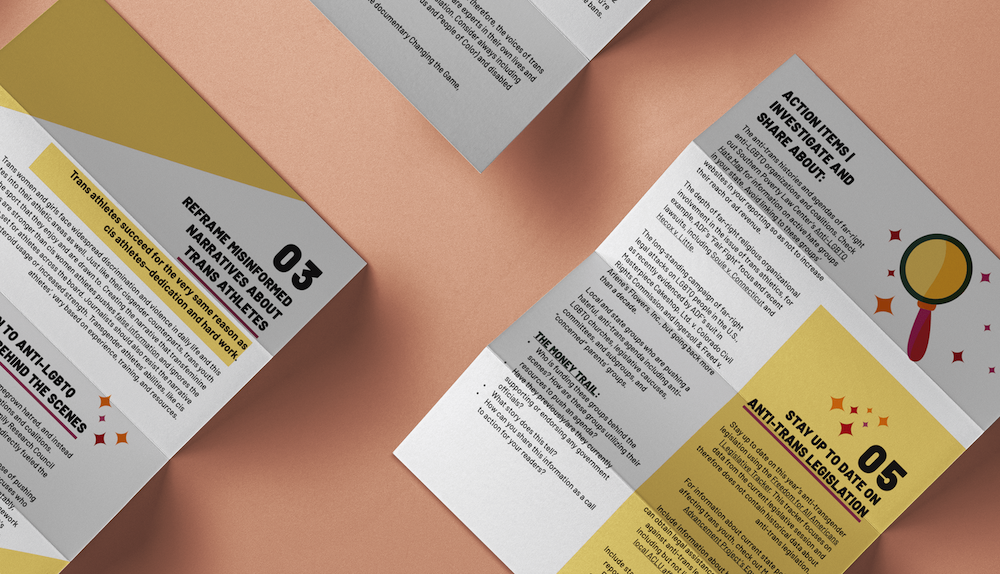
In this project, I collaborated with TLC on two guides which advise journalists on best practices when reporting on issues related to anti-trans legislation, specifically anti-trans medical and athletics bans. We worked together to create a solid visual ecosystem for these reports, including PDFs, landing pages, and social media graphics.
Our goal from the start of this project was to ensure the broadest availability of this information possible by discovering and designing for different use cases across diverse access points. Specific benchmarks kept in mind over the course of our discovery and delivery process included:
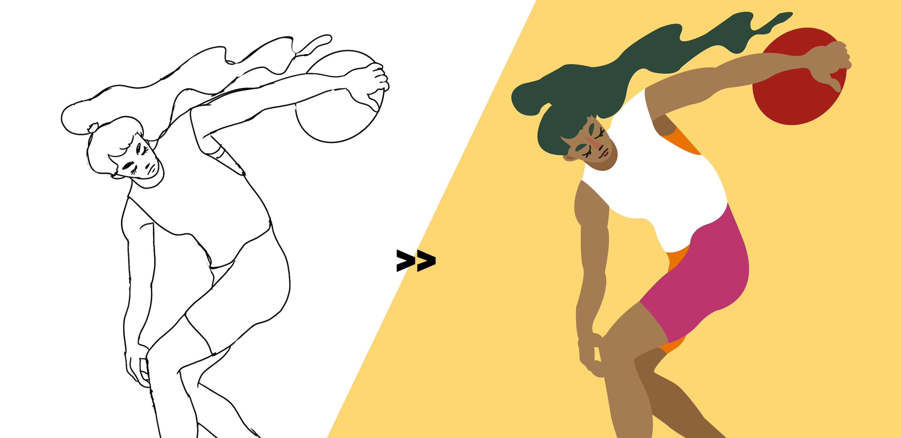
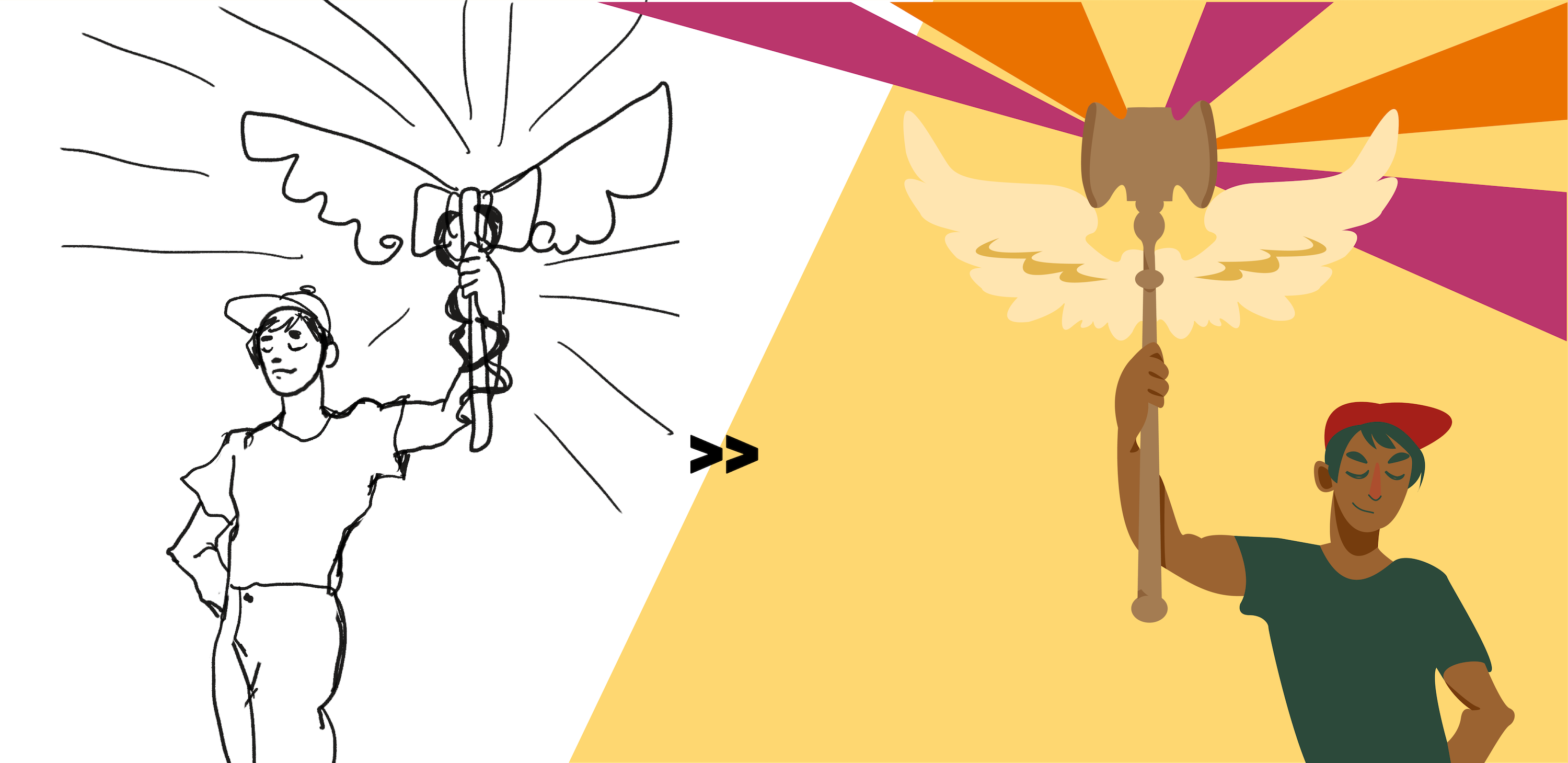
Before beginning the design process on the documents and web pages, I solidified the main visual elements I would be using across the breadth of the project. Starting with sketches and moving into vectorization, I sought to create a suite of simple, representative, and empowering imagery to accompany guide text.
Rather than visualizing disenfranchisement in the status quo, each primary image showcases a trans individual experiencing inclusion and the sense of euphoria and empowerment that goes along with that.
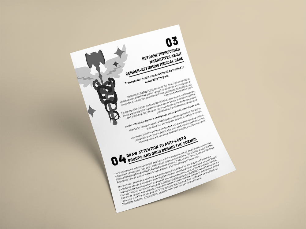
When approaching document design for this project, I prioritized readability above all else. By limiting background colors to white and pale yellow and text colors to black and dark green, I ensured maximum contrast to reduce eye strain.
By establishing a clear heading hierarchy, I ensured that the flow of the document was easy to follow and would not fatigue readers despite the considerable length of these resources.
Upon wrapping the visual design phase, I conducted a full accessibility audit and remediated each PDF to ensure full ADA compliance. Through inputting document metadata, reinforcing structural hierarchy in paragraph styles, and defining flow through article creation and layer reordering, I ensured that each document would be fully accessible by screen readers and other commonly used accessibility tools.
In recent years, incorporation of accessibility checks for web apps has become increasingly common in the product development process (yay). However, PDF remediation remains more obscure and likely to be forgotten, perhaps due in part to higher technical complexity and less options for tooling and guidance. These challenges should not undercut the weight of importance we place on including documents in our remediation workflows!

You can view these documents here (athletics) and here (medical).
A final point I considered in my design process was this: what other conditions may a person want to utilize these guides in? What if someone intends to print these documents out in black and white? While the digital PDF was completely readable, I worried about the hit contrast may take when being printed out by a low quality printer in grayscale. How would black text on a yellow background translate in those conditions? To assure readability in even the most rustic of hard copies, I created a second iteration of each document in grayscale that focuses on further optimizing text contrast.
You can view the high-contrast iterations of these documents here (athletics) and here (medical).
When designing landing page experiences to compliment the guides, I focused on retaining the visual identity established in the PDFs while taking into account web-specific concerns.
Namely, I sought to make sure that these landing pages were fully responsive and specifically paid mind to mobile design, knowing that a large portion of readers would convert over to TLC's site via Instagram and Twitter.
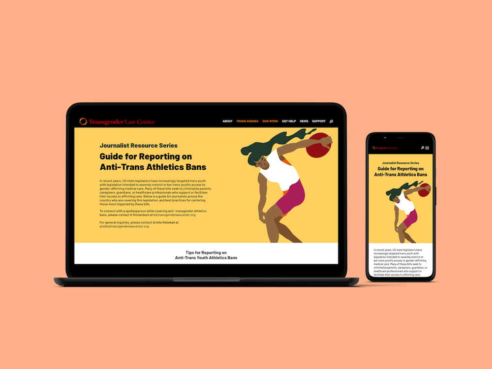
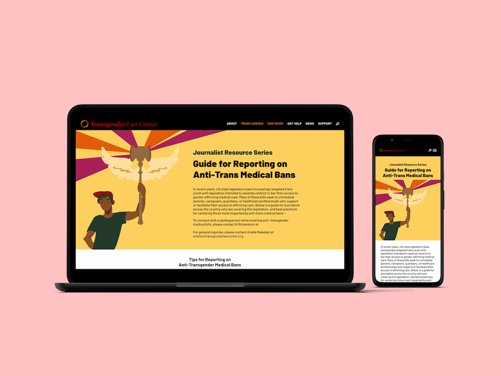
Ultimately, some facets of these designs had to be adjusted to accommodate the Wordpress builder being utilized by the dev team. However, none of the changes affect visual cohesion between the landing pages and their respective documents.
You can check out the live landing pages here (athletics) and here (medical).
Leading up to launch, TLC wanted to display both promotional graphics and graphics that introduced summarized versions of each document across multiple social media outlets.
Using a boiled-down copy deck, I designed two carousels for Instagram that would introduce each guide's main ideas and present viewers with the opportunity to learn more by navigating to the web experience. As is true with each facet of this project, I focused specifically on readability, balancing imagery with sparse amounts of high-contrast text to keep viewers swiping.
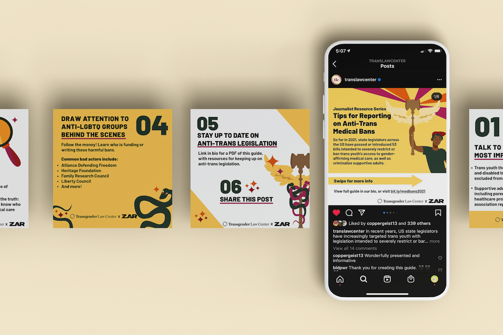
You can view these graphics live here (medical).
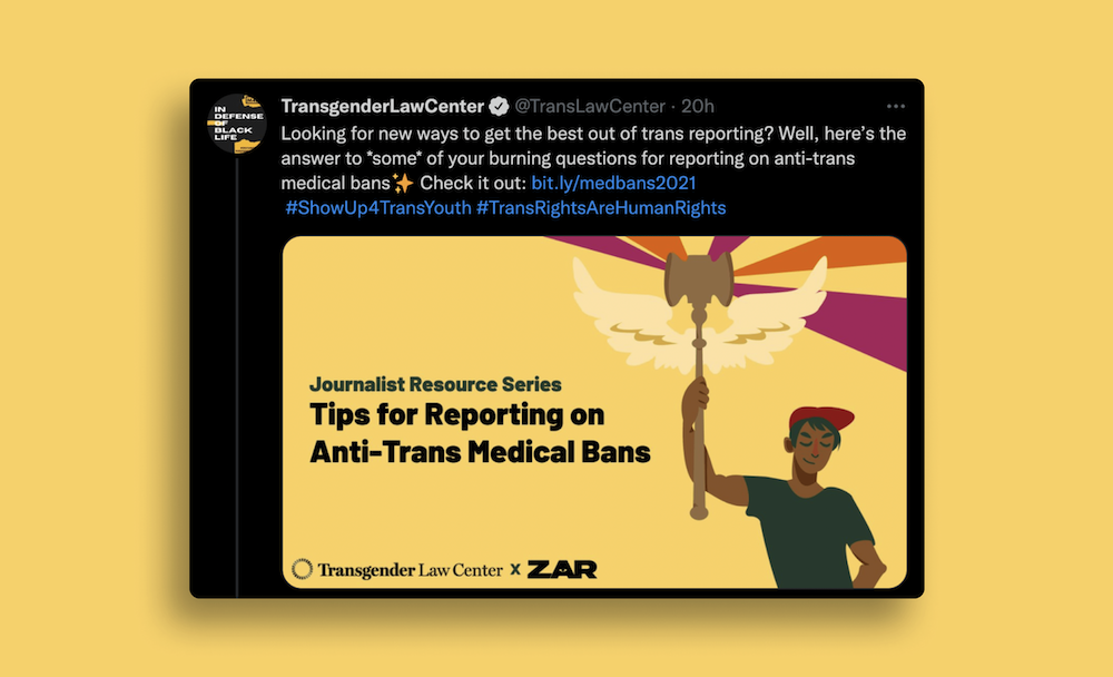
In addition, I created promotional banner images to be used on Twitter as well as for Open Graph images on the landing pages themselves:
This project married a number of individual skills I had been cultivating separately into one effort. Beyond the more obvious technical opportunities for learning (specifically with Adobe InDesign), my work on this initiative provided invaluable experience with creating cohesive visual identities across numerous platforms and mediums.
A few key indicators of success for this project include:
As I revisit this project in 2025, I am struck by the continued and growing importance of supporting journalistic integrity and leveraging design and visual communication skills to facilitate the flow of important information. I hope I will be able to engage in more work akin to this in the future!